Editing charts
After you have created a chart, you may find things you would like to change. Calc provides tools for changing the chart type, chart elements, data ranges, fonts, colors, and many other options, through the Insert and Format menus, the right-click (context) menu, and the Chart toolbar.
Contents
Changing the chart type
You can change the chart type at any time. To do so:
- First select the chart by double-clicking on it. The chart should now be surrounded by a gray border.
- Then do one of the following:
In each case, a dialog similar to the one in Choosing a chart type opens.
Adding or removing chart elements
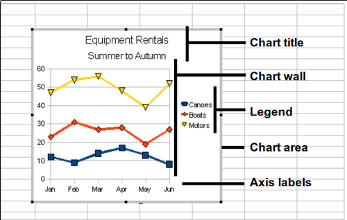
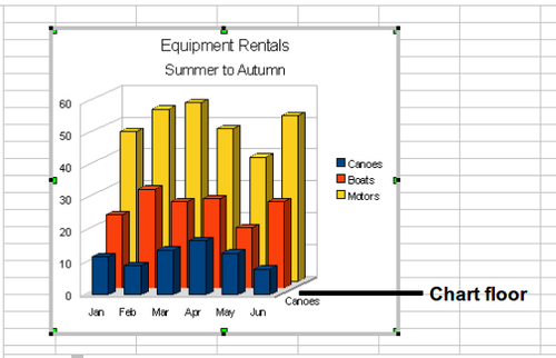
The figures below show the elements of 2D and 3D charts.
The default 2D chart includes only two of these elements:
- Chart wall contains the graphic of the chart displaying the data.
- Chart area is the area surrounding the chart graphic. The (optional) chart title and the legend (key) are in the chart area.
The default 3D chart also has the chart floor, which is not available in 2D charts.
You can add other elements using the Insert menu. The various choices open dialogs in which you can specify details.
First select the chart so the green sizing handles are visible. This is done with a single click on the chart.
The dialogs for Title, Legend, Axes, and Grids are self-explanatory. The others are a bit more complicated, so we’ll take a look at them here.
Data labels
Data labels put information about each data point on the chart. They can be very useful for presenting detailed information, but you need to be careful to not create a chart that is too cluttered to read.
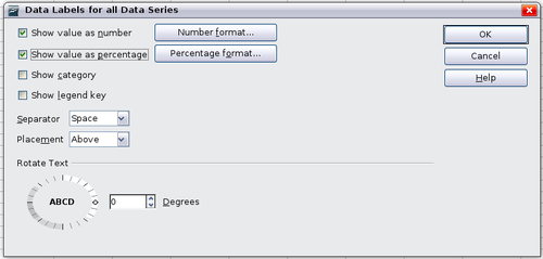
Choose Insert > Data Labels.
The options are as follows.
Show value as number
- Displays the numeric values of the data points. When selected, this option activates the Number format button.
Number format
- Opens the Number Format dialog, where you can select the number format. This dialog is very similar to the one for formatting numbers in cells, described in Entering, Editing, and Formatting Data.
Show value as percentage
- Displays the percentage value of the data points in each column. When selected, this option activates the Percentage format button.
Percentage format
- Opens the Number Format dialog, where you can select the percentage format.
Show category
- Shows the data point text labels.
Show legend key
- Displays the legend icons next to each data point label.
Separator
- Selects the separator between multiple text strings for the same object.
Placement
- Selects the placement of data labels relative to the objects.
This section shows examples of values as text (neither Show value as number nor Show value as percentage selected) and values as percentages, as well as when data values are used as substitutes for legends or in conjunction with them.
Trend lines
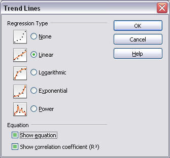
When you have a scattered grouping of points in a graph, you may want to show the relationship of the points. A trend line is what you need. Calc has a good selection of regression types you can use for trend lines: linear, logarithm, exponential, and power. Choose the type that comes closest to passing through all of the points.
To insert trend lines for all data series, double-click the chart to enter edit mode. Choose Insert > Trend Lines, then select the type of trend line from None, Linear, Logarithmic, Exponential, or Power. You can also choose whether to show the equation for the trend line and the coefficient of determination (R2).
To insert a trend line for a single data series, first select the data series in the chart, and then right-click and choose Insert > Trend Line from the context menu. The dialog for a single trend line is similar to the one below but has a second tab (Line), where you can choose attributes (style, color, width, and transparency) of the line.
To delete a single trend line or mean value line, click the line, then press the Del key.
To delete all trend lines, choose Insert > Trend Lines, then select None.
A trend line is shown in the legend automatically.
If you insert a trend line on a chart type that uses categories, such as Line or Column, then the numbers 1, 2, 3, ... are used as x-values to calculate the trend line.
The trend line has the same color as the corresponding data series. To change the line properties, select the trend line and choose Format > Object Properties > Line. This opens the Line tab of the Trend Lines dialog.
To show the trend line equation, select the trend line in the chart, right-click to open the context menu, and choose Insert Trend Line Equation.
When the chart is in edit mode, OpenOffice.org gives you the equation of the trend line and the correlation coefficient. Click on the trend line to see the information in the status bar. To show the equation and the correlation coefficient, select the line and choose Insert R2 and Trend Line Equation.
For more detail on the regression equations, see the topic Trend lines in charts in the Help.
Mean value lines
If you select mean value lines, Calc calculates the average of each selected data series and places a colored line at the correct level in the chart.
Y error bars
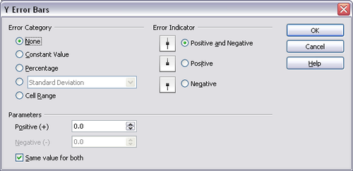
If you are presenting data which has a known possibility of error, such as social surveys using a particular sampling method, or you want to show the measuring accuracy of the tool you used, you may wish to show error bars on the chart. Select the chart and choose Insert > Y Error Bars.
Several options are provided on the Y Error Bars dialog. You can only choose one option at a time. You can also choose whether the error indicator shows both positive and negative errors, or only positive or only negative.
- Constant value – you can have separate positive and negative values.
- Percentage – choose the error as a percentage of the data points.
- In the drop-down list:
- Standard error
- Variance – shows an error calculated on the size of the biggest and smallest data points
- Standard deviation – shows error calculated on standard deviation
- Error margin – you designate the error
- Cell range – calculates the error based on cell ranges you select. The Parameters section at the bottom of the dialog changes to allow selection of the cell ranges.
To remove Y error bars, select the error indicator on the graph. The right-click context menu should contain the entry, "Delete Y error bars", which you can select to remove them from the graph.
| Content on this page is licensed under the Creative Common Attribution 3.0 license (CC-BY). |
