Proposal by Constantin Bürgi
|
|
|---|
|
Quick Navigation
Team |
| Please do not edit this page unless you are the original author. Your feedback and comments are welcome in the Comments section below or on the ui@ux.openoffice.org mailing list. |
Design Proposal "Complete Sidebar Design"
The following design proposal is part of the collection of design proposals for “Accessing Functionality”, which is part of Project Renaissance.
Contents
Summary and Status
There are two trends that influence the UI. First there is the hardware Trend to wide screens. This switch is already completed for macs. Second there is either the trend to thicker task/menu bars (windows/MS office), or there always were thicker task bars (gnome/KDE) Both these trends make the working area smaller, and the unused space bigger.
To overcome these two problems my proposed solution would be to minimize the space needed at the top and the bottom. This would be a UI, where only the menu bar (file, edit,...) is at the top, and all the rest of the menu would be on the right side of the working pane. This design works well on both small and big screens. On small screens the window would be maximized anyway, and even with a 4:3 screen the user would benefit from this, at least in Writer and Impress. If it is a large screen, the window will not be maximized, and hence the basic layout doesn't matter that much. It is also important to have something similar in all parts of OpenOffice, so the users find everything rapidly, if they use more than just one.
Status: Request for Comments
Mockup
Detailed Description
Writer
For Writer I would suggest, that the right side has two parts, and look similar to the task pane in Impress. There are different sections, that would basically hold the things, that were in the bars. These sections can be accessed through either the system in impress (Master Pages/Layouts...), or a more file like setting as in the Impress main pane (Normal, Outline, Notes,...), or this system with the buttons on the left side and not on top, that I would prefer. The first section would hold the content of File (new, open, save,...) The second section would hold the content of the formating tool bar. In the top part, there would be the styles & formatting menu, where only the predefined styles can be chosen. The lower part would hold the formatting tool bar itself. To encourage the use of the styles, they should be easily editable. I suggest, that they have little signs on the right to either delete or edit/save the styles. By clicking the edit button, the lower part would become the editing section for the style. The third section would be the insert section, where tables, images, drawings, formulas, etc. can be inserted into the document. For tables, the easiest way to do this would probably be a table mode (like in MS Office ribbon, see later) With these three sections most of the operations should be possible by a very small amount of clicks, and also in a very logical way. If the space doesn't suffice, there still could be some options with right clicking on the section (like MS)
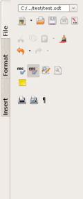
| This is the basic setup for the file tab, divided in the sections file setup, edit, review and printing
Missing: Buttons for record edits, may be search field instead of button for search & replace, help, secure document, templates, compare document, merge document?, navigator?, (page setup?) | |
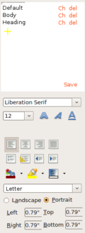
| This is the basic setup for the format tab, with the formatting section on top and the changing at the bottom.
The bottom is divided into single text setup, alignment, numbering, colors and page setup. Also there is missing lower ans upper case, and maybe some further under/over-line possibilities The main purpose of the red Ch/del and save is, that you can easily edit the styles. These are to be replaced by icons. If you click on the yellow plus, a new style will be created, containing the things chosen below (for example, you want to easily adapt the style of one paragraph, where you just defined the style to several). If you want to change one of the styles that are already there, you click on the ch button, and the style will be shown in the part below for easy editing. It would be preferably, if this changes would be live in the document, so that one can see what happens. After editing, you have to save the changes. By clicking the del button, the style will be deleted. (I don't know if OOO has the capacities to do this that way, or if it would be a new feature) | |
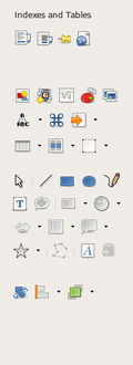
| This is the basic setup for the insert tab. |
Calc
The idea here is very similar to Writer. Also the sections would be the same (File, Formatting and Insert). But the content will be adapted to the most used items here, and can hence vary compared to Writer. Furthermore, the Formatting section will not be split, since there are very few people that use special layouts in Calc. But the line with the content of the cell would stay on top.
Impress
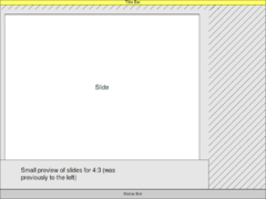
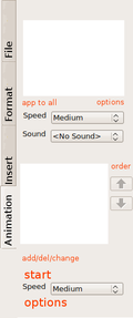
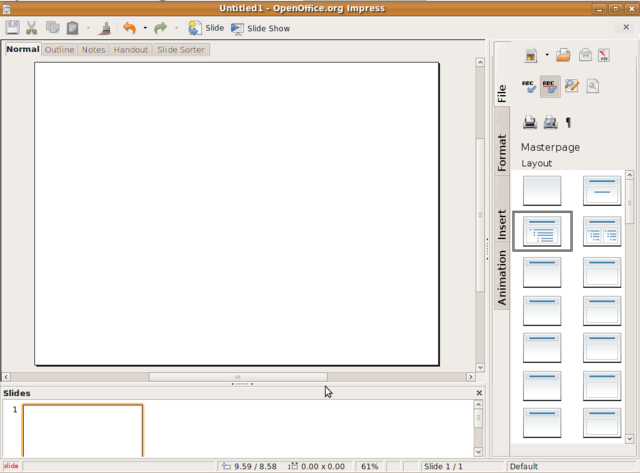
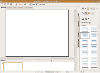
Well Impress is the most difficult thing, but fortunately, the UI today already has a nice division of the space (all the icons and objects need to be rearranged, but still). For the wide screen displays, even the two bars to the left and right are ok, but for 4:3 screens, the slides pane would better be positioned at the bottom, to make the working space larger. The proposal would still look very similar to Writer and Calc, maybe the pane to the right a bit wider. There are now four tabs to the right. The new one, Animations will hold both the animated elements and slide transitions. Compared to Writer or Calc, the first tab (File) holds also both master Pages and Layouts as buttons. By clicking on these buttons, a new tab opens, and more or less todays layout opens. The new Animations tab will have two sections, one for the slide transition and one for custom animations. The only elements shown for transitions will be the effect, a button to add to all slides, add sound, speed and a options button that would bring further options forward. The custom animation sections has also a effect listing as today, buttons to change the order buttons, the start and speed buttons, and an options button, that will bring further options forward. The buttons to start the slide show from the beginning or from the current slide should be outside the menu. Preferably in the status bar on the very left.
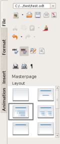
| Compared to the Writer file tab, here there is an additional section for the layout, but otherwise it is very similar. Also the Masterpages button will lead to a new tab, where the options for the Masterpages are shown. (see table) | |
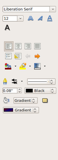
| Compared to the Writer format tab, the formatting section on top is missing, an at the bottom there is a lining section. Otherwise it is very similar, also with the missing bits like over/under-lining options. | |
| This is the basic outline for the Animations tab. There are missing buttons for the add delete and change. In the Animations section, the buttons for add/del/change could also be integrated into the effect listing, and hence leave more space for the other buttons. | |
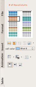
| If the table icon is clicked in the insert tab (especially in Impress), this new tab will open. A similar tab can open for advanced drawing options (with close to all options open), or master page, or anything, whose menu can be compressed/expanded to this size.
This new tab will only show, if either a table is (double) clicked on, or if a new one will be started. On the top, the number of rows/columns can be inserted. As with all previous mock ups, this is only a first draft. |
Additional Material and Mockups
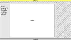
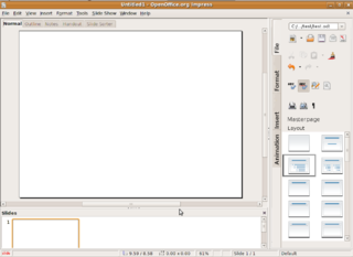
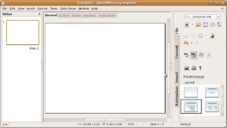
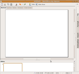
Here are two mockups, how it would finally look in Impress with wide screen and normal screen. Where the Icons for "start presentation" and "start presentation from this slide" should be, there is written "slide" in red.
It would look very similar in Writer and Calc. In Writer there is no slides bar, and in Calc there would be the functions bar on top, and everything else like in Writer.
Update
I have adapted the design a bit to the comments on Flux UI and Martinů. The menu bar (file/edit/...) isn't there anymore, but can still be shown by pressing the Alt key. (e.g. to find further options) It is replaced by a static menu that has the most used functions. As there is still some space, it could be used for further functions. (e.g. start slide show from current slide)
Update 2
I made further adaptations to both the other design proposals and the status meeting. The grouped elements in the menu can be rearranged, deleted or added by right clicking next to the icons, and choosing either "rearrange", where the grouped elements stay together but the order can be changed (e.g. if some user wants to put the group with the "open file" button at the bottom of the sidebar) Also "customize" can be chosen where the user can rearrange the icons within a group. If the width of the sidebar is changed, it might can't hold all the elements of a group. Then the small icon appears, to extend the elements (as in todays design).
It is also possible to include a collapse sidebar button at the very bottom of the sidebar (the open space below the tabs [File, Format,...]). Then just the tabs are shown, and by clicking on of the buttons, the clicked tab will open.
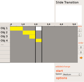
Last but not least, I added a possible new design for the animations. The user has a further button below up and down in the custom animations part of the animations tab. Normally the old menu is shown, but if the new button is clicked (e.g. an arrow to the left), the view is expanded, and a for some users better menu shows up.
The yellow bars are the opening animations and the white ones the closing animations. They can be edited, added or deleted by right clicking and rearranged by drag and drop. It should be limited to half second steps, or the fastest an animation can be done. Every horizontal line is a new object (e.g. an image). The name of the objects can be the file name to easily find the searched object. The thick black lines are the time breaks that need a mouse click to advance. To edit other parts of the presentation or go back to the old design, the user can click the new button (arrow to the right).
Author or Team Working on This Proposal
| Author / Team Member | Contact (OpenOffice.org login name, used for email) |
| Constantin Bürgi | Corsbu
|
Comments
| Community members, this is where your comments and questions concerning completeness and clarity should be written. Please add your OpenOffice.org login name to let us contact you via email. |
Your space :-)
| Dear Constantin, I think you should work together with the 'Proposal by Johannes Eva'. They to have an idea that is similar to yours, only they have worked out their proposal a bit further.
Greets --joey van der bie 11:39, 12 May 2009 (UTC) |
| Could it be used for a "netbook version" of OpenOffice? (If it is not approved for the normal version)
In any case it would be great to be given the option to change from the classic UI to the one you propose, since some will prefer your concept, while others won't. Best Regards --L4Linux 07:39, 13 May 2009 (UTC) |
|
I also think, that there should definitely be the option to switch back to the old design, or even provide more than one style, even if this means more work programming it. Especially, because the room division for 4:3 and 16:10/9 can be very different. Thanks for your comments :-) --Corsbu, 10:08, 18 May 2009 (UTC) |
|
Hi Constantin, can you explain how the red links 'Ch', 'Edit' and 'Save' in the format tab work? Especially why save is needed? If a user set e.g. the font size of a style to 10pt. How can he remove this font size setting from the style again? Best Regards--OO@WorldWartWeb.com 07:03, 14 May 2009 (UTC) |
|
Hi OO@WorldWartWeb.com, I updated the section, and now it should become more clear. To change the font size, you can just click on the change (ch) button and then change the font size below to the appropriate level (e.g. empty) and then save. Thanks for your comments :-) --Corsbu, 10:08, 18 May 2009 (UTC) |
|
Hi Constantin, Thank you for the answer, which explains the red text. But can you also explain how the given example task can be done: "If a user set e.g. the font size of a style to 10pt. How can he remove this font size setting from the style again?" Best Regards--OO@WorldWartWeb.com 07:45, 21 May 2009 (UTC) |
|
Hi OO@WorldWartWeb.com, I'm not sure, if I understand correctly. As I said before to change the font size, or any other style, you can just click on the change (ch) button. Then the lower part of the sidebar will now hold the actual style (maybe the color should change also to ensure the new meaning). If one item is then changed in the lower part, and save is clicked, the new style will be saved. I hope, I became now clear, otherwise just ask once more. --Corsbu, 22:38, 21 May 2009 (UTC) |
|
Hi Constantin, yes, it's clear to me how to change a value of a property that is assigned to a style. For example, if the property text size is assigned to a style, it's clear for me to change it from 10pt to 12pt. But how is it managed to remove the text size property from this style at all? Best Regards--OO@WorldWartWeb.com 08:40, 22 May 2009 (UTC) |
|
Hi OO@WorldWartWeb.com, Ah, now I understand, there should be a possible value in the text size field. There should be all the numbers (e.g. from 1 to 72) an also a value of blank (" ") if this one is selected, no text size will be added to the style, or it will be removed from the style. kind regards --Corsbu, 22:38, 22 May 2009 (UTC) |
| Hi Constantin, to what extend is the design of the particular items within the scope of your proposal? I notice that you use mainly icons, and rarely text to represent the functional items in the mockups. If this aspect is within the scope of your proposal, what distribution of textual and icon representation does your proposal suggest (only icon, mainly icon/sometimes textual, icons WITH text, mainly text/sometimes with icon, only text, etc.). Please clarify. (I'm aware that there will probably be textual tooltips for the icons -- I mean text that you can click on.)
Best Regards --Anjoschu 06:22, 21 May 2009 (UTC) |
|
Hi Anjoschu, I would love just to have icons, but this probably won't be possible, as certain functions don't have a standard icon, that every user understands immediately. But like the exact arrangement of the icons, I think the use of text with the icons should be possible to adapt where necessary and I think. There is a lot of flexibility in the proposal, as the main goal is the grouped sidebar with clearer arranged functions. Nevertheless, I think, that it should be mainly icons and just sometimes textual. --Corsbu, 22:38, 21 May 2009 (UTC) |


