Documentation/OOoAuthors User Manual/Writer Guide/Creating a simple form
Creating a simple form
This section explains how to create a simple form without any links to a data source or database and without advanced customization.
Create a document
There is nothing special to be done when creating a document to use as a form. Create a new Writer document with File > New > Text document.
Form toolbars
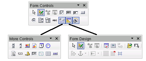
Two toolbars control form creation: Form Controls and Form Design. Select View > Toolbars > Form Controls and View > Toolbars > Form Design to show them both. See Form controls reference for a summary of the tools on these toolbars.
Tips: The Form Design toolbar can also be launched from the Form Controls toolbar. Some of the less commonly used controls are on a third toolbar—More Controls—also launched from the Form Controls toolbar.
You can dock these toolbars in different places on the Writer window, or leave them floating.

The three form design toolbars.
The Form Controls toolbar has a button for each of the most commonly used types of control.
Note: In OpenOffice.org form controls are the text boxes, list boxes, option buttons, push buttons and other items that can be placed in forms.
Design Mode
When creating a form, you will want to check that all the parts of the form work correctly. If design mode is off, the form behaves as it would for the end user. Buttons can be pressed, checkboxes checked and list items selected. If design mode is on, clicking on a control item selects it for editing.
Click the Design Mode On/Off button ![]() on the Form Controls toolbar to turn design mode on and off.
on the Form Controls toolbar to turn design mode on and off.
Tip: If the Design Mode button is not available, click on the Select button ![]() . This activates most of the tools on the three toolbars.
. This activates most of the tools on the three toolbars.
Insert form controls
- To insert a form control into the document, click the control’s icon to select it. The mouse pointer changes to look like this:

- Click in the document where you want the control to appear. (You can move it later.)
- Holding the left mouse button down, drag the control to size it.
- The control button remains active, so you can insert several controls of the same type without needing to go back to the toolbar.
- To change to another tool, click its icon on the toolbar.
To stop inserting controls, click on the Select button on the Form Controls toolbar, or click on any of the controls you have just inserted. The mouse pointer changes back to its normal appearance.
Tip: Holding down Shift when creating a form control makes the control square. If you press Shift when resizing an existing control, its proportions are kept the same.
Note: When you insert a group box, list box or combo box, a wizard is launched to guide you through the setup. If you prefer not to run the wizard, click the Wizards On/Off button ![]() on the Form Controls toolbar.
on the Form Controls toolbar.
Configure controls
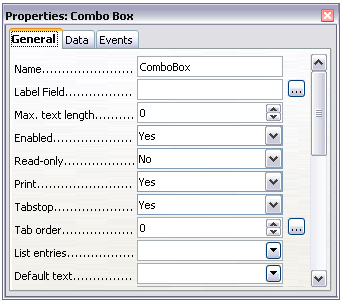
Having inserted the controls, you need to configure them to look and behave as you want. Right-click on a form control within your document and select Control from the pop-up menu.
The Form Control dialog box has three pages: General, Data and Events. For simple forms, only the General page is of any interest. On this page you can set the look and feel of the control.
Some controls have other useful options:
- Some controls have visible labels, such as Push Button and Option Button. The label text can be set.
- The List Box contains a list of options to choose from. Set these in the List entries box.
Tip Double-clicking on a control also brings up the Control Properties dialog box.

Control Properties dialog box.
Using the form
To use the form, leave design mode by clicking the Design Mode On/Off button ![]() .
.
A typical way to use a form is:
- You design the form, then save it when you are happy with it.
- You send the form to others (for example, by email).
- They fill in the form, save it and send it back to you.
- You open the form and see what their answers are.
Tip: By using a data source, or setting a form to update over the web, you can automatically gather data. However, both of those are more complex and you might prefer to keep things simple.
Form controls reference
Form Control toolbar
| |
Select a form control to perform some other action on it. |
| |
Toggle between design mode on (to edit forms) and design mode off (to use forms). |
| |
Launch form control properties dialog box. This dialog box can be kept open as different controls are selected. |
| |
Launch form properties dialog box, controlling properties for the form as a whole, such as which data source it connects to. |
| |
A box that can be selected or deselected on the form. You can label the box. |
| |
Control to create a box into which the form user can type any text. |
| |
Control allowing numeric formatting options. For example, you can set maximum and minimum values for the number entered, or the number type (decimal places, scientific, currency). |
| |
Creates a button that can be linked to a macro. The label is the name that appears on the button. |
| |
Creates an option or radio button. When multiple buttons are grouped together, only one can be selected at a time. The easiest way to group multiple buttons is to use the Group Box button on the More Controls toolbar, with wizards enabled. |
| |
Creates a list of options, as a pull-down menu, that the user can choose from. If wizards are on, creating a list box launches the List Box Wizard. This wizard is only useful if your form is linked to a data source.
If not linked to a data source, turn wizards off and create an empty list box. Then click the Control button and, in the List Entries option on the General tab, enter the options you want to appear on the list. |
| |
As with a List Box, you set up a list of choices. In addition a panel at the top either displays the choice made or allows the form user to type in something else. Otherwise this works the same as the List Box. |
| |
A text label. The difference between this and just typing on the page is that, as a control, you can link a label field to macros so, for example, something happens when the mouse passes over it or clicks on it. |
| |
Launch the More Controls toolbar. |
| |
Launch the Form Design toolbar (which can also be opened with View > Toolbars > Form Design). |
| |
Some form controls (List Box and Combo Box) have optional wizards. If you do not want the wizard to launch when you create one of these controls, use the Wizards On/Off button to switch wizards off. |
More Controls toolbar
Form Design toolbar
| Content on this page is licensed under the Creative Common Attribution 3.0 license (CC-BY). |