Logo Usage Guidelines Proposals
Proposals for Logo Usage Guidelines
The following are ideas and proposals of how to define the use of the OpenOffice.org logo. None of these are official, but are being discussed by the Branding initiative.
You will find more detailed information about the Branding Guidelineshere
Proposal for Conference and seasonal Logos
This is a proposal among others (collected at BeDipp's user page) of how to integrate the OpenOffice.org Logo with different graphical elements or conference logos. The white space is reduced compared to the normal logo and the font in this proposal isn't the final.

Here are two examples of how to fill the orb (in this case with a graph [1] and a foto [2]), but the idea is to leave the space within the orb to the creativity of the assigned design team.
#1

#2

(The foto is under a Creative Commons license. By jphilipg)
Fonts
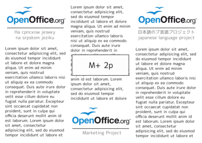
The logo can be accompanied with additional text for conference, seasonal or project specific use. This font will be the default font to use together with the logo. It is important that the chosen font supports a wide range of languages and scripts (i.e. unicode font). This will benefit consistency among different projects and languages.
Proposals:
- DejaVu Sans - font home
- Droid Sans - font home
- Liberation Sans - font home
- M+ 1p - font home
- Molengo - font home
- Nobile - font home
- Vegur ( problems with Version 601 on Mac CS4 Illustrator ) - font home

- M+ fonts: M+ 1p M+ 1c M+ 2p M+ 2c


Source for the font comparison graphics
PDF with dummy text: http://wiki.services.openoffice.org/w/images/0/09/New_font_2010.pdf


Comparison with special interest on numbers: version designation and OOo10 anniversary (Design based on Miguel Boto's work):
