Logo Usage Guidelines
| This page is in a DRAFT state! Modifications will take place WITHOUT ANY FURTHER NOTICE! |
| Don't rely on information given here if you need guidelines for your work. Even if the discussion about the content of this page is in a final stage, major changes might become true during the next days or weeks. Please join the discussions on our mailing list if you want to take part in these decisions. |
WHAT : What do we mean by talking about the OpenOffice.org logo?
This is the present OpenOffice.org logo:
 Copyright © 2010, Oracle and/or its affiliates. All rights reserved.
IF : Are you allowed to use the logo?
Because of the necessity to protect the brand OpenOffice.org our logo is not licensed under an open source license. As it is trademarked you are allowed to use it if you follow the OpenOffice.org Trademark Policy asking you to use our brand only to refer to our product and our community.
HOW : In which surroundings should you use the logo?
Our logo should be presented in a way that refers to our product and/or our community in a respectful and not misleading way. At the same time we want to strengthen the OpenOffice.org brand by providing a consistent visual impression of our logo.
We want to achieve these goals by the rules and recommendations brought together in these guidelines:
Contents
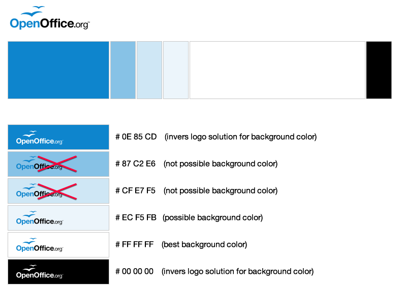
Logo colors and background
| Please do not use the color picker to extract the colors. The colors shown on your screen may have been already altered by your computer's color management system. |
The OpenOffice.org logo consists of these colors:
| Blue | Black | |
| HEX | # 0E85CD | # 000000 |
| RGB | 14, 133, 205 | 0, 0, 0 |
| CMYK | not yet defined | not yet defined |
| Pantone | not yet defined | not yet defined |
The logo works best on a white background, but it can be placed on light blue background too, if the blue tone fits to our logo's color and is light enough to keep the contrast to the logo.
For darker backgrounds we provide an inverted (white only) logo, that can be positioned on backgrounds in the logo colors: Black (#000000) and Blue (#0E85CD).
Different colored backgrounds to the logo or gradients extending the light blue background (#ECF5FB) should be avoided. Use a white area behind the logo instead.
We provide two more versions of our logo for special use-cases: Black only for monochrome printing without any other colors and Grey/Black for greylevel printers. Please be aware that only the Blue/Black logo is the original OpenOffice.org logo that should be used wherever possible.
| Black only | Grey (55%) | Black | |
| HEX | # 000000 | # 717171 | # 000000 |
| RGB | 0, 0, 0 | 113, 113, 113 | 0, 0, 0 |
| CMYK | not yet defined | not yet defined | not yet defined |
| Pantone | not yet defined | not yet defined | not yet defined |
| Percentage Black | 100% | 55% | 100% |
No other modifications to the logo
As already defined in the Trademark Policy the logo is not allowed to be modified. This includes changes in color or shades, outlines and sub- or superposed images as well as aspect ratio and (re)moving parts of the logo:
Never change the color of the logo or use different shades.
Never outline the logo.
Do not place any imagery inside the logo.
Never stretch the logo from it's original form but respect its aspect ratio.
Do not place the gulls on a different place.
Do not remove the ™ (trademark symbol)
Whitespace
to be done ....
reduced whitespace for project internal usage
to be done ....
accompanying font
to be done ....


