Difference between revisions of "Base/New features in 3 2"
(→Property browser: Button controls: new "Default State" property, applicable to toggle buttons) |
m (Link for the french translation) |
||
| (19 intermediate revisions by 2 users not shown) | |||
| Line 1: | Line 1: | ||
| − | = OOo Base 3.2 new features = | + | = OOo Base 3.2 new features = |
| − | from features at dba openoffice org until m55 | + | |
| + | from features at dba openoffice org until m55 | ||
| + | |||
| + | = General = | ||
| + | |||
| + | == Configuration based database drivers == | ||
| − | |||
| − | |||
Currently the database drivers are hard coded in OOo. The integration of new ones as extension isn't possible. Therefor all drivers have to bring their own configuration with them. | Currently the database drivers are hard coded in OOo. The integration of new ones as extension isn't possible. Therefor all drivers have to bring their own configuration with them. | ||
| + | <br> Each driver has to define: | ||
| − | + | - URLPattern : defines the URL which the driver supports | |
| − | - | + | - ParentURLPattern : allows to define a parent hierarchy |
| − | - | + | - Driver : defines the UNO factory name used to create the db driver |
| − | - | + | - DriverTypeDisplayName : defines the name which is shown to the user when creating a new database |
| − | + | <br> Additionally 3 sets can be filled, which are | |
| + | - Properties : describes properties which the driver understand | ||
| − | + | - Features : describes which checkboxes should be shown in the special settings dialog | |
| − | - | + | - MetaData : describes additional settings which are handled by the db application itself |
| − | + | <br> As this 3 categories are set, it can not be defined what the sets will contain. | |
| − | + | <br> But currently they support: | |
| + | // known JDBC settings | ||
| − | + | JavaDriverClass | |
| + | // known settings for file-based drivers | ||
| − | + | Extension | |
| − | + | CharSet | |
| − | + | HeaderLine | |
| − | + | FieldDelimiter | |
| − | + | StringDelimiter | |
| − | + | DecimalDelimiter | |
| − | + | ThousandDelimiter | |
| − | + | ShowDeleted | |
| − | + | // known ODBC settings | |
| − | + | SystemDriverSettings | |
| − | + | UseCatalog | |
| − | + | // settings related to auto increment handling | |
| − | + | AutoIncrementCreation | |
| − | + | AutoRetrievingStatement | |
| − | + | IsAutoRetrievingEnabled | |
| − | // | + | // known Adabas D driver setting |
| − | + | ShutdownDatabase | |
| − | + | DataCacheSizeIncrement | |
| − | + | DataCacheSize | |
| − | + | ControlUser | |
| − | + | ControlPassword | |
| − | + | // known LDAP driver settings | |
| − | + | HostName | |
| − | + | PortNumber | |
| − | + | BaseDN | |
| − | + | MaxRowCount | |
| − | + | // misc known driver settings | |
| − | + | ParameterNameSubstitution | |
| − | + | AddIndexAppendix | |
| − | + | // known SDB level settings | |
| − | + | IgnoreDriverPrivileges | |
| − | + | NoNameLengthLimit | |
| − | + | AppendTableAliasName | |
| − | + | GenerateASBeforeCorrelationName | |
| − | + | ColumnAliasInOrderBy | |
| − | + | EnableSQL92Check | |
| − | + | BooleanComparisonMode | |
| − | + | TableTypeFilterMode | |
| − | + | RespectDriverResultSetType | |
| − | + | UseSchemaInSelect | |
| − | + | UseCatalogInSelect | |
| − | + | EnableOuterJoinEscape | |
| − | + | PreferDosLikeLineEnds | |
| − | + | FormsCheckRequiredFields | |
| − | + | EscapeDateTime | |
| − | + | IgnoreCurrency | |
| − | + | TypeInfoSettings | |
| − | + | LocalSocket | |
| − | + | <br> Please have a look at the configuration schema: | |
| − | + | org.openoffice.Office.DataAccess/Drivers.xcs for more information. | |
| − | + | == Configuration option to control the availability of "Create new database" option in the "Create Database" wizard == | |
| − | + | A configuration option "/org.openoffice.Office.DataAccess/Policies/Features/Base/CreateLocalDatabase" has been introduced, which is of type boolean, defaulted to "true", and controls whether the "Create Database" wizard (started via File/New/Database) exposes the "Create a new database" option. It can be set in file: .../basis3.2/share/registry/schema/org/openoffice/Office/DataAccess.xcs | |
| + | = Table = | ||
| − | + | == Copy Table Wizard: "First line as column names" == | |
| − | + | The Copy table Wizard now contains an additional check box which is enabled when RTF or HTML format is to copied into a database. The check box is label: | |
| − | + | "Use first line as column names" ; | |
| − | + | ||
| − | + | ||
| − | + | When checked the first row is used to identify column names, when not checked the first row will be handled as a normal data row. | |
| − | + | <br> [[Image:First line.PNG]] | |
| + | = Query = | ||
| − | + | == Copying queries between database documents uses source name == | |
| − | + | When you copy queries between database document, you're not prompted for the target name anymore, unless it is really necessary. | |
| − | + | ||
| − | When you copy queries between database document, you're not prompted for the target name anymore, unless it is really necessary. | + | |
| + | <br> That is, if you copy "some query" from database A to database B, then it will be inserted into B as "some query". Previously (up to 3.1), you were prompted for a name, which was defaulted to "Query1", completely ignoring the source name. | ||
| − | + | <br> Only if the name already exists in the target database (in particular, if you copy a query into the same DB), the dialog is opened, and now pre-filled with the source name instead of "Query1". | |
| + | <br> | ||
| − | + | = Form = | |
| + | == Multi-line text form controls preserving their selection == | ||
| − | |||
| − | |||
Multi-line text controls in forms now preserve their selection when losing and re-gaining the focus, making text exchange (like multiple cut'n'pastes) somewhat easier this way. | Multi-line text controls in forms now preserve their selection when losing and re-gaining the focus, making text exchange (like multiple cut'n'pastes) somewhat easier this way. | ||
| − | == Forms can be zoomed == | + | == Forms can be zoomed == |
| − | + | ||
| − | + | Database forms can now be zoomed, much like all other OOo documents: | |
| − | + | You'll find the usual View/Zoom menu item, and the zoom slider in the status bar. | |
| − | + | (Ctrl+Scroll wheel continues to work, as it already did before.) | |
| − | + | ||
| + | == Property browser: Added Position, Size, and Anchor == | ||
| − | + | In the property browser for form controls, you can now also change the position and size of the control, as well as its anchor (in document types where anchoring is supported, e.g. text docs and spreadsheets). | |
| + | <br> This is especially useful when you want to modify the geometry of multiple controls at once, which previously required invocation of a modal dialog for every control, and now can be done by selecting all controls, and simply entering the new value(s) in the property browser. | ||
| − | [[Image:]] | + | <br> [[Image:Position anchor and fonts.PNG]] |
== Property browser: Font name/style/size displayed == | == Property browser: Font name/style/size displayed == | ||
| + | |||
When displaying the properties of a form control in the property browser, the "Font" property will now display the name, the style (regular, bold, italic) and the size of the current control font. | When displaying the properties of a form control in the property browser, the "Font" property will now display the name, the style (regular, bold, italic) and the size of the current control font. | ||
| + | <br> Previously the respective field was simply empty, and the font could only be seen when opening the Character Set dialog. | ||
| − | + | <br> | |
| + | == Property browser: Human-readable event bindings == | ||
| − | |||
The event bindings in the form/control property browser are now somewhat more human readable, in that a binding formerly displayed as: | The event bindings in the form/control property browser are now somewhat more human readable, in that a binding formerly displayed as: | ||
| − | vnd.sun.star.script:Standard.Module1.Main?language=Basic&location=application | + | vnd.sun.star.script:Standard.Module1.Main?language=Basic&location=application |
now is displayed as: | now is displayed as: | ||
| − | Standard.Module1.Main (application, Basic) | + | Standard.Module1.Main (application, Basic) |
| − | [[Image:]] | + | [[Image:Assigned action.PNG]] |
| + | == Property browser: Event assignments can be reset with DEL key == | ||
| − | + | In the form/control property browser, event assignments can be reset using the DEL key. That is, the read-only input field which is to display (but not modify) the event assignment now at least accepts DEL, completely revoking the assignment for the given event. | |
| − | In the form/control property browser, event assignments can be reset using the DEL key. That is, the read-only input field which is to display (but not modify) the event assignment now at least accepts DEL, completely revoking the assignment for the given event. | + | |
| + | <br> | ||
| − | == Property browser: "Mouse wheel scroll" == | + | == Property browser: "Mouse wheel scroll" == |
| − | + | ||
| − | + | ||
| − | + | All form controls which are able to react on the mouse wheel, by scrolling or spinning their content, got a new property called "Mouse wheel scroll". This property is available in the control property browser, immediately below the "Tab order" property, and can take one out of three possible values: | |
| − | - | + | - Never: Completely ignore the mouse wheel |
| − | - | + | - When focused: react on the mouse wheel only when the control currently has the focus |
| + | - Always: always react on the mouse wheel, even when the control currently does not have the focus, but the mouse is over the control when the wheel is operated | ||
| − | The defaults for this property is "When focused", which means newly created controls behave as before. | + | <br> The defaults for this property is "When focused", which means newly created controls behave as before. |
| + | <br> When writing documents with controls making use of this new property, older versions will silently ignore the property. | ||
| − | + | <br> In the table data view for database documents, this property is used to prevent the user accidentally spinning the content of numeric grid columns: In this view, the mouse wheel is used to scroll the complete result set, not individual cell content (which formerly happened accidentally and too easily). | |
| + | <br> [[Image:Mouse wheel scroll.PNG]] | ||
| − | + | == Property browser: Mouse-selection-behavior in property combo boxes changed == | |
| − | + | In the property browser, for properties displayed using a combo box (so you can enter free text, but select from a pre-defined list of possible options as well), the behavior for mouse selections changed: | |
| − | + | ||
| − | + | ||
| − | + | ||
| − | In the property browser, for properties displayed using a combo box (so you can enter free text, but select from a pre-defined list of possible options as well), the behavior for mouse selections changed: | + | |
Formerly, when you selected an entry from the list, you needed to focus another cell somewhere else before the changed value was committed (even though it was already entered into the text field). | Formerly, when you selected an entry from the list, you needed to focus another cell somewhere else before the changed value was committed (even though it was already entered into the text field). | ||
| − | Now, the property value is committed already when you select the entry from the list, which makes the work flow somewhat smoother in many cases. | + | Now, the property value is committed already when you select the entry from the list, which makes the work flow somewhat smoother in many cases. |
| + | == Property browser: Renamed "Print" to "Printable" == | ||
| − | + | The property "Print" in the property browser, when invoked for a form control, has been renamed to "Printable". | |
| − | The property "Print" in the property browser, when invoked for a form control, has been renamed to "Printable". | + | |
| − | [[Image:]] | + | [[Image:Printable.PNG]] |
| − | == Property browser: Button controls: renamed the action-related events == | + | == Property browser: Button controls: renamed the action-related events == |
| − | + | ||
| + | Form control buttons feature two events which are fired when the button is pressed, one to veto the actual firing, and one to do an actual action associated with the button. | ||
| − | Formerly, they were called "Before commencing" and "When initiating", and as such a constant source of confusion, since it was non-obvious which event to use for which purpose. | + | <br> Formerly, they were called "Before commencing" and "When initiating", and as such a constant source of confusion, since it was non-obvious which event to use for which purpose. |
| + | <br> This situation hopefully improved a little bit with renaming the events (in the property browser) to "Approve action" and "Execute action". | ||
| − | + | [[Image:Button events mod.PNG]] | |
| − | + | == Property browser: Button controls: new "Default Status" property, applicable to toggle buttons == | |
| + | Button controls in documents now have an additional property "Default status". It is enabled if and only if the button's "Toggle" property is set to "Yes", and works like the "Default status" property for e.g. check box controls: It controls in which status the button will be when resetting the form to which the button belongs. | ||
| − | + | <br> [[Image:Toggle.PNG]] | |
| − | + | ||
| + | <br> [[Image:Toggle Defaultstatus not selected.PNG]] | ||
| − | [[Image:]] | + | [[Image:Toggle Defaultstatus selected.PNG]] |
| + | == Property browser: "Visible" == | ||
| − | + | The new boolean property "Visible" has been added to all form control types (except the "Hidden control", which has no visual representation in the document, anyway). | |
| − | + | <br> This property controls whether or not the control shall be visible in alive mode. In design mode, the control is always painted as before, to not make designing an invisible control unnecessarily difficult. | |
| − | + | ||
| + | <br> Note that if this property is set to "Yes" (the default, mimicking the behavior as known up to 3.1), this not necessarily means the control will really appear on the screen. Additional constraints are applied when calculating a control's effective visibility. For instance, a control placed in a hidden section in Writer will never be visible at all, until at least the section itself becomes visible. | ||
| − | + | <br> If the property is set to "No", then the control will always be hidden in alive mode, no matter what. | |
| + | <br> OpenOffice.org versions up to OOo 3.1 will silently ignore this property when reading documents which make use of it. | ||
| − | + | <br> The property is also used when im/exporting documents to Microsoft Excel's binary file format. | |
| − | + | ||
| − | + | ||
| − | + | ||
| − | + | ||
| − | + | ||
| − | + | ||
| − | + | ||
| − | + | ||
| − | The property is also used when im/exporting documents to Microsoft Excel's binary file format. | + | |
| − | + | ||
| − | + | ||
| + | [[Image:Visible.PNG]] | ||
= Report = | = Report = | ||
| − | |||
| − | |||
| − | |||
| − | |||
| − | |||
| − | |||
| − | == Sun Report Builder: | + | == Sun Report Builder: Controls bound to data source displays it data source name == |
| − | + | ||
| − | + | In Sun Report Builder all controls bound to a data source displays it's data source name the prefix is like Calc a '=' (equal). | |
| − | + | <br> [[Image:Datasource name.PNG]] | |
| − | == Sun Report Builder: | + | == Sun Report Builder: Toolbar items has now also menu items == |
| − | + | ||
| + | All current toolbar items for Report Builder are now also available in the menu structure. | ||
| − | + | For clear work, all items which manipulate existing fields can found in the edit menu structure like section shrink or control resizings. New controls which have to insert are stored in the insert menu | |
| − | + | structure like picture or shapes. | |
| − | + | == Sun Report Builder: Shrink Sections == | |
| + | There exist 3 new items in the toolbar to remove empty space between section ranges and the first or last control. | ||
| − | + | <br> <nowiki>* Top shrink removes the top empty space between section top range and the first top control.</nowiki> | |
| + | <nowiki>* Bottom shrink removes the bottom empty space between the section bottom range and the last bottom control.</nowiki> | ||
| − | + | <nowiki>* Shrink removes free spaces from both directions from top and from bottom. </nowiki> | |
| + | <br> This function could be very helpful if the report will be export as Calc spreadsheet. | ||
| − | + | <br> [[Image:Shrink toobar SRB.PNG]] | |
| − | + | ||
| − | + | == Sun Report Builder: Context menu contains also section shrink items == | |
| + | The context menu in active section contains a shrink item, which has a sub menu for the new shrink feature. | ||
| − | [[Image:]] | + | <br> [[Image:Shrink2.PNG]] |
| + | == Sun Report Builder: Grouping Dialog has a new up/down/delete toolbar == | ||
| − | + | In Report Builder grouping dialog exist a new toolbar which handles the up and down of grouping entries and also a new delete button to remove grouping entries. | |
| − | In Report Builder grouping dialog exist a new toolbar which handles the up and down of grouping entries and also a new delete button to remove grouping entries. | + | |
| + | <br> [[Image:Sorting and grouping.PNG]] | ||
| − | + | == Sun Report Builder: Report Wizard supports binary field types == | |
| + | It is possible to select BINARY, VARBINARY, LONGVARBINARY datatypes in the Report Wizard. This will insert Image Controls instead of formatted fields. The images will be set 4 cm high. Pictures will scale down to this size. | ||
| − | + | [[Category:Database]] [[fr:FR/Documentation/Base/Nouvelles Fonctions 3 2|fr:FR/Documentation/Base/Nouvelles Fonctions 3 2]] | |
| − | + | ||
Latest revision as of 20:52, 5 May 2010
Contents
- 1 OOo Base 3.2 new features
- 2 General
- 3 Table
- 4 Query
- 5 Form
- 5.1 Multi-line text form controls preserving their selection
- 5.2 Forms can be zoomed
- 5.3 Property browser: Added Position, Size, and Anchor
- 5.4 Property browser: Font name/style/size displayed
- 5.5 Property browser: Human-readable event bindings
- 5.6 Property browser: Event assignments can be reset with DEL key
- 5.7 Property browser: "Mouse wheel scroll"
- 5.8 Property browser: Mouse-selection-behavior in property combo boxes changed
- 5.9 Property browser: Renamed "Print" to "Printable"
- 5.10 Property browser: Button controls: renamed the action-related events
- 5.11 Property browser: Button controls: new "Default Status" property, applicable to toggle buttons
- 5.12 Property browser: "Visible"
- 6 Report
- 6.1 Sun Report Builder: Controls bound to data source displays it data source name
- 6.2 Sun Report Builder: Toolbar items has now also menu items
- 6.3 Sun Report Builder: Shrink Sections
- 6.4 Sun Report Builder: Context menu contains also section shrink items
- 6.5 Sun Report Builder: Grouping Dialog has a new up/down/delete toolbar
- 6.6 Sun Report Builder: Report Wizard supports binary field types
OOo Base 3.2 new features
from features at dba openoffice org until m55
General
Configuration based database drivers
Currently the database drivers are hard coded in OOo. The integration of new ones as extension isn't possible. Therefor all drivers have to bring their own configuration with them.
Each driver has to define:
- URLPattern : defines the URL which the driver supports
- ParentURLPattern : allows to define a parent hierarchy
- Driver : defines the UNO factory name used to create the db driver
- DriverTypeDisplayName : defines the name which is shown to the user when creating a new database
Additionally 3 sets can be filled, which are
- Properties : describes properties which the driver understand
- Features : describes which checkboxes should be shown in the special settings dialog
- MetaData : describes additional settings which are handled by the db application itself
As this 3 categories are set, it can not be defined what the sets will contain.
But currently they support:
// known JDBC settings
JavaDriverClass
// known settings for file-based drivers
Extension
CharSet
HeaderLine
FieldDelimiter
StringDelimiter
DecimalDelimiter
ThousandDelimiter
ShowDeleted
// known ODBC settings
SystemDriverSettings
UseCatalog
// settings related to auto increment handling
AutoIncrementCreation
AutoRetrievingStatement
IsAutoRetrievingEnabled
// known Adabas D driver setting
ShutdownDatabase
DataCacheSizeIncrement
DataCacheSize
ControlUser
ControlPassword
// known LDAP driver settings
HostName
PortNumber
BaseDN
MaxRowCount
// misc known driver settings
ParameterNameSubstitution
AddIndexAppendix
// known SDB level settings
IgnoreDriverPrivileges
NoNameLengthLimit
AppendTableAliasName
GenerateASBeforeCorrelationName
ColumnAliasInOrderBy
EnableSQL92Check
BooleanComparisonMode
TableTypeFilterMode
RespectDriverResultSetType
UseSchemaInSelect
UseCatalogInSelect
EnableOuterJoinEscape
PreferDosLikeLineEnds
FormsCheckRequiredFields
EscapeDateTime
IgnoreCurrency
TypeInfoSettings
LocalSocket
Please have a look at the configuration schema:
org.openoffice.Office.DataAccess/Drivers.xcs for more information.
Configuration option to control the availability of "Create new database" option in the "Create Database" wizard
A configuration option "/org.openoffice.Office.DataAccess/Policies/Features/Base/CreateLocalDatabase" has been introduced, which is of type boolean, defaulted to "true", and controls whether the "Create Database" wizard (started via File/New/Database) exposes the "Create a new database" option. It can be set in file: .../basis3.2/share/registry/schema/org/openoffice/Office/DataAccess.xcs
Table
Copy Table Wizard: "First line as column names"
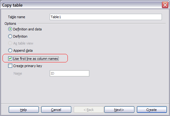
The Copy table Wizard now contains an additional check box which is enabled when RTF or HTML format is to copied into a database. The check box is label:
"Use first line as column names" ;
When checked the first row is used to identify column names, when not checked the first row will be handled as a normal data row.
Query
Copying queries between database documents uses source name
When you copy queries between database document, you're not prompted for the target name anymore, unless it is really necessary.
That is, if you copy "some query" from database A to database B, then it will be inserted into B as "some query". Previously (up to 3.1), you were prompted for a name, which was defaulted to "Query1", completely ignoring the source name.
Only if the name already exists in the target database (in particular, if you copy a query into the same DB), the dialog is opened, and now pre-filled with the source name instead of "Query1".
Form
Multi-line text form controls preserving their selection
Multi-line text controls in forms now preserve their selection when losing and re-gaining the focus, making text exchange (like multiple cut'n'pastes) somewhat easier this way.
Forms can be zoomed
Database forms can now be zoomed, much like all other OOo documents:
You'll find the usual View/Zoom menu item, and the zoom slider in the status bar.
(Ctrl+Scroll wheel continues to work, as it already did before.)
Property browser: Added Position, Size, and Anchor
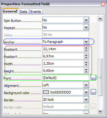
In the property browser for form controls, you can now also change the position and size of the control, as well as its anchor (in document types where anchoring is supported, e.g. text docs and spreadsheets).
This is especially useful when you want to modify the geometry of multiple controls at once, which previously required invocation of a modal dialog for every control, and now can be done by selecting all controls, and simply entering the new value(s) in the property browser.
Property browser: Font name/style/size displayed
When displaying the properties of a form control in the property browser, the "Font" property will now display the name, the style (regular, bold, italic) and the size of the current control font.
Previously the respective field was simply empty, and the font could only be seen when opening the Character Set dialog.
Property browser: Human-readable event bindings
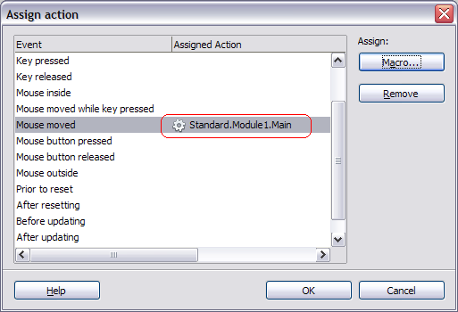
The event bindings in the form/control property browser are now somewhat more human readable, in that a binding formerly displayed as:
vnd.sun.star.script:Standard.Module1.Main?language=Basic&location=application
now is displayed as:
Standard.Module1.Main (application, Basic)
Property browser: Event assignments can be reset with DEL key
In the form/control property browser, event assignments can be reset using the DEL key. That is, the read-only input field which is to display (but not modify) the event assignment now at least accepts DEL, completely revoking the assignment for the given event.
Property browser: "Mouse wheel scroll"
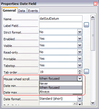
All form controls which are able to react on the mouse wheel, by scrolling or spinning their content, got a new property called "Mouse wheel scroll". This property is available in the control property browser, immediately below the "Tab order" property, and can take one out of three possible values:
- Never: Completely ignore the mouse wheel
- When focused: react on the mouse wheel only when the control currently has the focus
- Always: always react on the mouse wheel, even when the control currently does not have the focus, but the mouse is over the control when the wheel is operated
The defaults for this property is "When focused", which means newly created controls behave as before.
When writing documents with controls making use of this new property, older versions will silently ignore the property.
In the table data view for database documents, this property is used to prevent the user accidentally spinning the content of numeric grid columns: In this view, the mouse wheel is used to scroll the complete result set, not individual cell content (which formerly happened accidentally and too easily).
Property browser: Mouse-selection-behavior in property combo boxes changed
In the property browser, for properties displayed using a combo box (so you can enter free text, but select from a pre-defined list of possible options as well), the behavior for mouse selections changed:
Formerly, when you selected an entry from the list, you needed to focus another cell somewhere else before the changed value was committed (even though it was already entered into the text field).
Now, the property value is committed already when you select the entry from the list, which makes the work flow somewhat smoother in many cases.
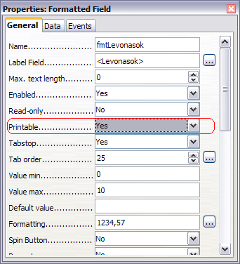
Property browser: Renamed "Print" to "Printable"
The property "Print" in the property browser, when invoked for a form control, has been renamed to "Printable".
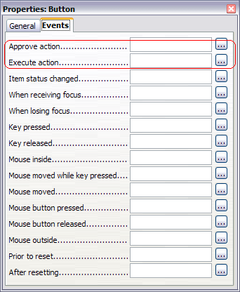
Form control buttons feature two events which are fired when the button is pressed, one to veto the actual firing, and one to do an actual action associated with the button.
Formerly, they were called "Before commencing" and "When initiating", and as such a constant source of confusion, since it was non-obvious which event to use for which purpose.
This situation hopefully improved a little bit with renaming the events (in the property browser) to "Approve action" and "Execute action".
Property browser: Button controls: new "Default Status" property, applicable to toggle buttons
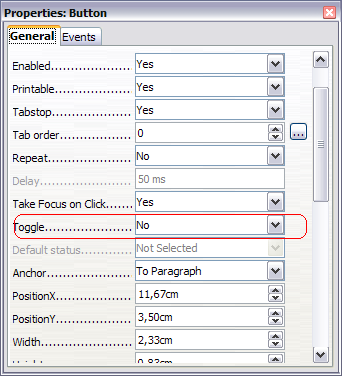
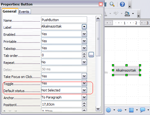
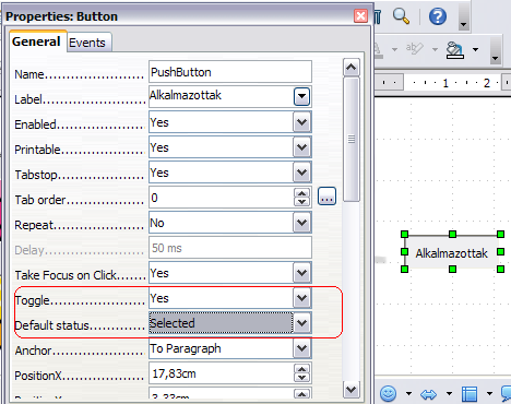
Button controls in documents now have an additional property "Default status". It is enabled if and only if the button's "Toggle" property is set to "Yes", and works like the "Default status" property for e.g. check box controls: It controls in which status the button will be when resetting the form to which the button belongs.
Property browser: "Visible"
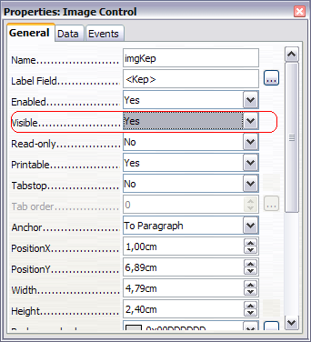
The new boolean property "Visible" has been added to all form control types (except the "Hidden control", which has no visual representation in the document, anyway).
This property controls whether or not the control shall be visible in alive mode. In design mode, the control is always painted as before, to not make designing an invisible control unnecessarily difficult.
Note that if this property is set to "Yes" (the default, mimicking the behavior as known up to 3.1), this not necessarily means the control will really appear on the screen. Additional constraints are applied when calculating a control's effective visibility. For instance, a control placed in a hidden section in Writer will never be visible at all, until at least the section itself becomes visible.
If the property is set to "No", then the control will always be hidden in alive mode, no matter what.
OpenOffice.org versions up to OOo 3.1 will silently ignore this property when reading documents which make use of it.
The property is also used when im/exporting documents to Microsoft Excel's binary file format.
Report
Sun Report Builder: Controls bound to data source displays it data source name
In Sun Report Builder all controls bound to a data source displays it's data source name the prefix is like Calc a '=' (equal).
All current toolbar items for Report Builder are now also available in the menu structure.
For clear work, all items which manipulate existing fields can found in the edit menu structure like section shrink or control resizings. New controls which have to insert are stored in the insert menu
structure like picture or shapes.
Sun Report Builder: Shrink Sections
There exist 3 new items in the toolbar to remove empty space between section ranges and the first or last control.
* Top shrink removes the top empty space between section top range and the first top control.
* Bottom shrink removes the bottom empty space between the section bottom range and the last bottom control.
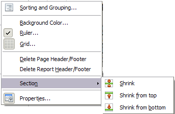
* Shrink removes free spaces from both directions from top and from bottom.
This function could be very helpful if the report will be export as Calc spreadsheet.
The context menu in active section contains a shrink item, which has a sub menu for the new shrink feature.
Sun Report Builder: Grouping Dialog has a new up/down/delete toolbar
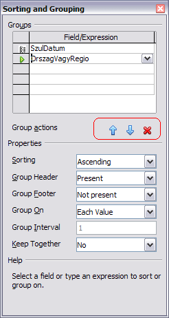
In Report Builder grouping dialog exist a new toolbar which handles the up and down of grouping entries and also a new delete button to remove grouping entries.
Sun Report Builder: Report Wizard supports binary field types
It is possible to select BINARY, VARBINARY, LONGVARBINARY datatypes in the Report Wizard. This will insert Image Controls instead of formatted fields. The images will be set 4 cm high. Pictures will scale down to this size.
