Difference between revisions of "Mac OS X Porting - Native Controls"
(→ComboBox) |
(→HIComboBoxCreate() documentation) |
||
| Line 71: | Line 71: | ||
use the HIComboBoxCreate function or DrawThemeButton with the appropriate constant. | use the HIComboBoxCreate function or DrawThemeButton with the appropriate constant. | ||
| + | |||
| + | |||
| + | ====DrawThemeButton() documentation==== | ||
| + | |||
| + | <pre> | ||
| + | DrawThemeButton | ||
| + | Draws a button. | ||
| + | |||
| + | OSStatus DrawThemeButton ( | ||
| + | const Rect * inBounds, | ||
| + | ThemeButtonKind inKind, | ||
| + | const ThemeButtonDrawInfo * inNewInfo, | ||
| + | const ThemeButtonDrawInfo * inPrevInfo, | ||
| + | ThemeEraseUPP inEraseProc, | ||
| + | ThemeButtonDrawUPP inLabelProc, | ||
| + | UInt32 inUserData | ||
| + | ); | ||
| + | Parameters | ||
| + | inBounds | ||
| + | A pointer to a structure of type Rect. Pass a rectangle specifying the boundary of the button, in local coordinates. | ||
| + | |||
| + | inKind | ||
| + | A value of type ThemeButtonKind. Pass a constant specifying the type of button to draw. See “Theme Buttons” for descriptions of possible values. | ||
| + | |||
| + | inNewInfo | ||
| + | A pointer to a structure of type ThemeButtonDrawInfo. Before calling DrawThemeButton, set the structure to contain the new state, value, and adornment for the button. DrawThemeButton uses the information passed in the inNewInfo and inPrevInfo parameters to apply transitional animation or sound effects as the button state changes, if such are specified under the current theme. | ||
| + | |||
| + | inPrevInfo | ||
| + | A pointer to a structure of type ThemeButtonDrawInfo. If the button state is changing, set the structure to contain the previous state, value, and adornment for the button, to allow DrawThemeButton to apply any transitional effects. If the button state is not changing, you can pass NULL. | ||
| + | |||
| + | inEraseProc | ||
| + | A value of type ThemeEraseUPP. If you have a custom background, use this parameter to pass a universal function pointer to an application-defined function such as that described in ThemeEraseProcPtr. DrawThemeButton calls this function to erase the background before drawing the button. If you pass NULL, DrawThemeButton's default behavior is to erase the background for you. | ||
| + | |||
| + | inLabelProc | ||
| + | A value of type ThemeButtonDrawUPP. If you pass a universal function pointer to an application-defined function such as that described in ThemeButtonDrawProcPtr, DrawThemeButton calls that function to draw the label of the button. If you pass NULL, no label is drawn. | ||
| + | |||
| + | inUserData | ||
| + | An unsigned 32-bit integer. Provide any data to be passed in to the callback functions specified in the inLabelProc and inEraseProc parameters. Pass NULL if you do not wish to provide any data. | ||
| + | |||
| + | Return Value | ||
| + | A result code. See “Appearance Manager Result Codes”. | ||
| + | |||
| + | Discussion | ||
| + | The DrawThemeButton function draws a theme-compliant button. If a ThemeEraseProcPtr is specified in the inEraseProc parameter, DrawThemeButton uses that function to erase the background of the button before drawing the button. After the button is drawn, if a ThemeButtonDrawProcPtr is specified in the inLabelProc parameter, DrawThemeButton calls that function to draw the button’s label. | ||
| + | |||
| + | Note that DrawThemeButton also draws any appearance adornments for the button and that these can extend beyond the button’s basic bounding rectangle, as specified in the inBounds parameter, and may be of variable shape. You may therefore wish to call the function GetThemeButtonBackgroundBounds to obtain the actual rectangle containing the pixels belonging to a button under the current theme. | ||
| + | |||
| + | Version Notes | ||
| + | This function is available with Appearance Manager 1.1 and later. | ||
| + | |||
| + | Availability | ||
| + | Available in CarbonLib 1.0 and later when Appearance 1.1 or later is present. | ||
| + | Available in Mac OS X 10.0 and later. | ||
| + | Declared In | ||
| + | Appearance.h | ||
| + | </pre> | ||
====HIComboBoxCreate() documentation==== | ====HIComboBoxCreate() documentation==== | ||
Revision as of 13:00, 13 October 2006
Contents
- 1 Native Controls
- 1.1 Contributors
- 1.2 Introduction
- 1.3 Apple Documentation and References
- 1.4 The Appearance Manager and HITheme
- 1.5 Native controls in VCL
- 1.6 The native controls and the implementation
- 1.7 Current state of native controls
- 1.8 Links
Native Controls
Contributors
- Eric Bachard: Ericb
- Pierre de Filippis: Pdefilippis aliscafo@gmail.com
- Pavel Janik
- Christian Lippka: CL
Introduction
The purpose of this article is to present our current knowledge and progress of the implementation of native controls in the native Mac OS X version of OpenOffice.org. Our goal by implementing native controls is to remove the win32 look as much as possible and replace it by the Aqua look and feel using the Carbon API.
Apple Documentation and References
The Appearance Manager and HITheme
Apple provides an easy way to change a custom user interface to an aqua interface by using the Appearance Manager(AM). This API was first developed for Mac OS 8 and is centered around QuickDraw. The AM is less and less supported by Apple since 10.2 and any implementation needs to be replaced with the HIToolbox version: HITheme. The problem with HITheme is that its implementation started on Mac OS X 10.2 (Jaguar) and has since gone under many revisions and new functions have been progressively added with each new version of OS X. Therefore some functions in the 10.4 version might not be in 10.3 or 10.2. This will probably be one of the reason why the native version of OpenOffice.org will run on Mac OS X 10.4 and higher only.
Using HITheme
Unfortunately there is not much documentation provided by Apple about HITheme. Thus we have to look at the HITheme.h header file directly and read the extensive comments to understand how to use this API. All the constants used to describe the type of controls that we want to implement is still the same as in the AM. This is the reason why the AM reference document is still useful and should always be opened when implementing native controls. The AM and HITheme are very similar in the way they approach the implementation of native controls, most of the time the functions have similar names and the arguments different types so you can always use the AM reference to give you an idea about the procedure to follow.
- Location of HITheme.h: /Developer/SDKs/MacOSX10.4u.sdk/System/Library/Frameworks/Carbon.framework/Versions/A/Frameworks/HIToolbox.framework/Versions/A/Headers/HITheme.h
Native controls in VCL
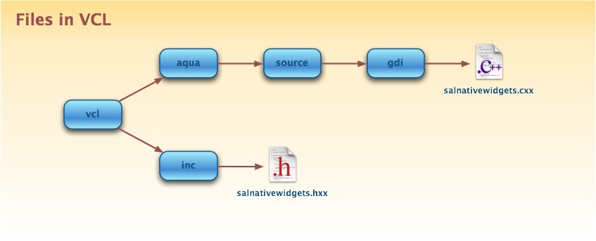
salnativewidgets.cxx
This file was copied directly from the Windows implementation of native controls. All the useless functions were removed and we are left with 6 functions:
- isNativeControlSupported: function called to see if a control should be implemented natively or not. A big switch statement that goes through all the controls and part of controls possible. Returns true when a control is supported. Each time a new control is implemented this function should be modified so the new native code is used at compile time.
- hitTestNativeControl: Boolean function. If the return value is TRUE, bIsInside contains information whether aPos was or not inside the native widget specified by the nType/nPart combination. This function will be used to redefine left/top buttons controls areas for e.g. the scrollbar.
- getState: a translation from the VCL constants to the Carbon constants of the state of controls.
- drawNativeControl: the most important function. This is where the code for new native controls is written. Again it is a big switch statment that lists each control with the corresponding implementation. Needs to be modified each time a new control is implemented.
- drawNativeControlText: [TO DO]
- getNativeControlRegion: [TO DO]
salnativewidgets.hxx
Uses AquaSalGraphics class, defined in vcl/aqua/inc/salgdi.h. AquaSalGraphics itself inherits of SalGraphics virtual class (defined in vcl/inc/salgdi.hxx).
This header file describes all the structures, classes and constants used to get the state and properties of the VCL controls. It is necessary to be familiar with this file since its content will be used to translate the state and properties to their Carbon equivalent.
Most of the stuff used in salnativewidgets.hxx are from HITheme.h (or Appearance.h for previous test)
The native controls and the implementation
Here is a list of all the controls that need to be native. Since some of them do not have the same name in VCL and Carbon, they are listed in this format: <VCL name> - <Carbon name> when they are different.
Push Button
- Implemented by: Pdefilippis
This is the regular OK, Cancel buttons.
[FIXME] How implement Heart Beat effect ? ( should be something default)
Radio Button
- Implemented by: Pdefilippis
This is the regular radio button.
Check Box
- Implemented by: Pdefilippis
This is the regular check box.
ComboBox
- STARTED : Ericb
Control that pops up a menu, but does NOT allow data entry

From OSXHIGuidelines.pdf, page 253:

For Carbon, ComboBoxes are available in Interface Builder. To create them programmatically
use the HIComboBoxCreate function or DrawThemeButton with the appropriate constant.
DrawThemeButton() documentation
DrawThemeButton
Draws a button.

OSStatus DrawThemeButton (
   const Rect * inBounds,
   ThemeButtonKind inKind,
   const ThemeButtonDrawInfo * inNewInfo,
   const ThemeButtonDrawInfo * inPrevInfo,
   ThemeEraseUPP inEraseProc,
   ThemeButtonDrawUPP inLabelProc,
   UInt32 inUserData
);
Parameters
inBounds
A pointer to a structure of type Rect. Pass a rectangle specifying the boundary of the button, in local coordinates.

inKind
A value of type ThemeButtonKind. Pass a constant specifying the type of button to draw. See “Theme Buttons” for descriptions of possible values.

inNewInfo
A pointer to a structure of type ThemeButtonDrawInfo. Before calling DrawThemeButton, set the structure to contain the new state, value, and adornment for the button. DrawThemeButton uses the information passed in the inNewInfo and inPrevInfo parameters to apply transitional animation or sound effects as the button state changes, if such are specified under the current theme.

inPrevInfo
A pointer to a structure of type ThemeButtonDrawInfo. If the button state is changing, set the structure to contain the previous state, value, and adornment for the button, to allow DrawThemeButton to apply any transitional effects. If the button state is not changing, you can pass NULL.

inEraseProc
A value of type ThemeEraseUPP. If you have a custom background, use this parameter to pass a universal function pointer to an application-defined function such as that described in ThemeEraseProcPtr. DrawThemeButton calls this function to erase the background before drawing the button. If you pass NULL, DrawThemeButton's default behavior is to erase the background for you.

inLabelProc
A value of type ThemeButtonDrawUPP. If you pass a universal function pointer to an application-defined function such as that described in ThemeButtonDrawProcPtr, DrawThemeButton calls that function to draw the label of the button. If you pass NULL, no label is drawn.

inUserData
An unsigned 32-bit integer. Provide any data to be passed in to the callback functions specified in the inLabelProc and inEraseProc parameters. Pass NULL if you do not wish to provide any data.

Return Value
A result code. See “Appearance Manager Result Codes”.

Discussion
The DrawThemeButton function draws a theme-compliant button. If a ThemeEraseProcPtr is specified in the inEraseProc parameter, DrawThemeButton uses that function to erase the background of the button before drawing the button. After the button is drawn, if a ThemeButtonDrawProcPtr is specified in the inLabelProc parameter, DrawThemeButton calls that function to draw the button’s label.

Note that DrawThemeButton also draws any appearance adornments for the button and that these can extend beyond the button’s basic bounding rectangle, as specified in the inBounds parameter, and may be of variable shape. You may therefore wish to call the function GetThemeButtonBackgroundBounds to obtain the actual rectangle containing the pixels belonging to a button under the current theme.

Version Notes
This function is available with Appearance Manager 1.1 and later.

Availability
Available in CarbonLib 1.0 and later when Appearance 1.1 or later is present.
Available in Mac OS X 10.0 and later.
Declared In
Appearance.h
HIComboBoxCreate() documentation
HIComboBoxCreate
Creates a combo box control.

OSStatus HIComboBoxCreate (
   const HIRect* boundsRect,
   CFStringRef text,
   const ControlFontStyleRec* style,
   CFArrayRef list,
   OptionBits inAttributes,
   HIViewRef* outComboBox
);
Parameters
boundsRect
The bounding box of the control.

text
The default text in the editable portion of the control. Can be NULL.

style
The font style of the both editable text and the text in the disclosure list. Can be NULL.

list
The default values available in the disclosure list. Can be NULL.

inAttributes
The default attributes of the combo box. For possible values, see “Combo Box Attributes”.

outComboBox
On exit, a pointer to a reference for the new control.

Discussion
The combo box can be used in compositing mode, as well as traditional Control Manager mode. When created, this view is invisible. To see the view, you must show the view by calling HIViewSetVisible.
ScrollBar
- Implemented by: Ericb
This is the regular scrollbar.
Current status
[FIXED] Aqua scrollbar works now as expected (see vcl/aqua/source/gdi/salnatigewidgets.cxx in aquavcl01 cws )
Translation of the Control Area
AquaSalGraphics::IsNativeControlSupported() returns true -> nType is ok , getstate() works , DrawNativeControl() works fine two, and several controls are drawn.
Everything seems to work excepted the button control area, because left/top control button is not located the same way for vcl and for aqua control : same behaviour, but different places.
Vertical scrollbar vcl : top (Button1) / bottom (Button2) aqua: both at bottom
Horizontal scrollbar: vcl : left (Button1) /right ( Button2) aqua: both on right
-> our problem is simple : translate the coordinates of the control area of left/top button under aqua control, else, clicking on the left of the scrollbar ... the button on right is active :-)
(same bug for vertical bar).
Solution proposed by Philipp Lohmann and Jan Holesovsky :
"...The actual hit testing is done in the overloaded SalGraphics::hitTestNativeControl method, so you can implement your own sensitive areas there. The getNativeControlRegion is used for drawing purposes (so the buttons are drawn at the positions you tell there)..."
[done] implement AquaSalGraphics::hitTestNativeControl() for scrollbar, to translate left/top control areas, and manage rIsInside Boolean variable.
How a ScrollBar is drawn
After printing out the part numbers passed to draw a ScrollBar, I found out how it is actually drawn out:
- 1. Part 101 - PART_BUTTON_UP
- 2. Part 102 - PART_BUTTON_DOWN
- 3. Part 211 - PART_THUMB_VERT
- 4. Part 201 - PART_TRACK_VERT_UPPER
- 5. Part 203 - PART_TRACK_VERT_LOWER
The first two parts are self-explanatory. The last 3 are a little more confusing at first especially since some heights and widths can be negative. But here is what they are.
Part 211
This part is the slider. As described by its value, it is vertical. The horizontal equivalent is part 210 - PART_THUMB_HORZ.
Part 201 - Part 203
These are the parts that are between the slider and the arrows. Part 201 is between the slider and the upper arrow. Part 203 is between the slider and the lower arrow. Each one of them can actually have a negative size in the case where the slider touches one or both of the arrows. The equivalents for a horizontal scrollbar are part 200 - PART_TRACK_HORZ_LEFT and part 202 - PART_TRACK_HORZ_RIGHT.
(18 September)
Pierre fixed an important bug, and we now have vertical scrollbar working fine (last remaining problem is top arrow), but horizontal is still having problems.
todo : fix top arrow, and improve horizontal scrollbar.
(10th September) Now the scrollbar is correctly drawn. Missing: always full (needs some work). modify the top control coordinates, manage active/not active.
Patch available here : http://eric.bachard.free.fr/mac/aquavcl/patches/controls/scrollbar/scrollbar10sept.diff
Screenshots :
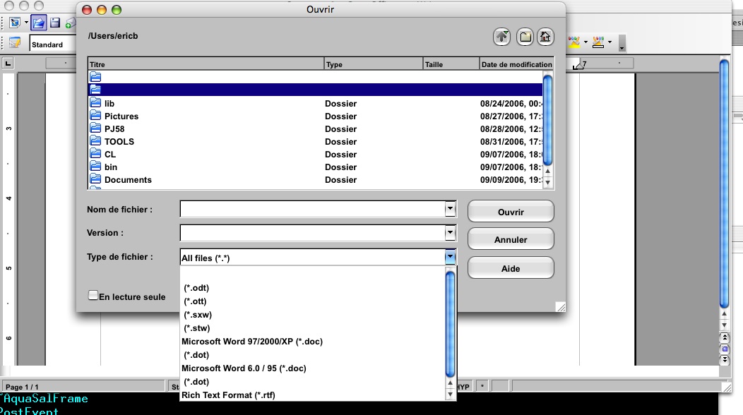
(03rd September) Does not work as expected, work in progress to fix arrows issue, and obtain correct redrawing (arrows are correctly drawn, but not at good place). See screenshot:
More to come...
Controls not yet implemented
BOOL AquaSalGraphics::IsNativeControlSupported() returns true when control is one of the listed controls :
CTRL_COMBOBOX : Combobox, i.e. a ListBox
CTRL_SPINBOX : two standalone spin buttons without an edit field
CTRL_SPINBUTTONS : two standalone spin buttons without an edit field
CTRL_EDITBOX : control that allows text entry
CTRL_MULTILINE_EDITBOX : Control that allows text entry ( some systems distingish between single and multi line edit boxes )
CTRL_LISTBOX : Control that pops up a menu, but does NOT allow data entry
CTRL_TAB_PANE : the border around a tab area, but without the tabs themselves. May have a gap at the top for the active tab
CTRL_TAB_BODY : background of a Tab Pane
CTRL_FIXEDBORDER : a rectangular border, like a Tab Pane, but without the possible gap for a tab
CTRL_TAB_ITEM : a single tab
Probably not needed :
CTRL_TOOLBAR : a toolbar control with buttons and a grip
CTRL_MENUBAR : the menubar
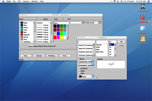
Current state of native controls
Links
This work is part of http://wiki.services.openoffice.org/wiki/Mac_OS_X_Porting_-_Work_Areas/Todo%27s
